
Charts can tell you a lot of things as a trader. The MoneyShow Chart of the Week below speaks VOLUMES...the only question is, are you listening?
Take a look at the image, which shows the three-month performance of five ETFs: One each that tracks Real Estate Investment Trusts (REITs), utilities, gold, smaller cap stocks, and declines in the US dollar...
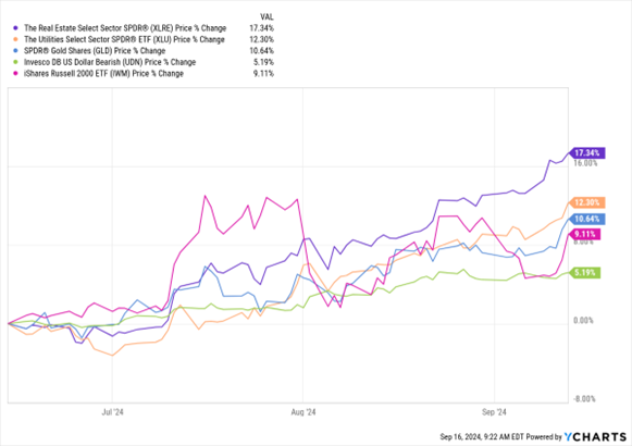
Data by YCharts
You can see that just in the last 90 days, the Real Estate Select Sector SPDR Fund (XLRE) soared 17.3%. The Utilities Select Sector SPDR ETF (XLU) rallied 12.3%. The SPDR Gold Shares ETF (GLD) climbed 10.6%. The iShares Russell 2000 ETF (IWM) rose 9.1%. And the Invesco DB US Dollar Index Bearish Fund (UDN) gained 5.1%.
What’s the message here? That the Federal Reserve is going to cut interest rates early, often, and by a large amount!
When it does, that historically benefits bonds, gold, and rate-sensitive sectors of the stock market. It also tends to disproportionally favor small caps because those companies typically have higher debt loads and therefore benefit more from falling interest rates. On the flip side, lower rates hurt the value of the dollar.
I’ve been recommending ways to profit in Chart of the Week articles the last few months, including this one on bonds from June and this one on gold from August. I hope those worked out for you.
As for stocks and the ongoing market rotation to NEW winners? What’s not to like? This is healthy and it’s likely to continue. Play that trend for all it’s worth! After all, the Fed is finally on your side.


