
When will Federal Reserve policymakers cut interest rates? How many times will they cut? Heck, WILL they even cut?
Guessing the Fed’s next moves has become a popular parlor game on and off Wall Street. And today’s MoneyShow Chart of the Week can give you some insights into the latest thinking...
Rate Cut Forecasts Shifting...But Markets Sanguine?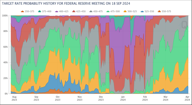
Source: CME FedWatch Tool, 4/3/24
No, you’re not looking at a work of abstract art. You’re looking at a graphical representation of how market rate perceptions have changed with time.
Each colored area on the chart represents a different level for the federal funds rate, which is currently set in a range of 5.25% - 5.5%. The wider the colored area, the greater the market’s perceived chance the funds rate would be set in that range by the time the Fed’s September 2024 meeting rolled around.
See all that purple, red, and even darker green in the middle of the chart? That’s because back at the start of 2024, market participants thought the Fed would likely cut rates five to six times by September. Now, the biggest colored areas are light green and orange. That’s because markets have dialed those cut predictions back to just one or two.
So, what does it MEAN for you as a trader? Continue to play the rotation into sectors and stocks levered to stronger growth. Favor bonds and bond ETFs with more credit risk than plain-vanilla Treasuries. And target growth-sensitive commodities like oil for potential gains.
Be sure to keep an eye on shifting forecasts, though. The stock market CAN handle getting fewer Fed cuts this year. But it’d have a harder time if Fed rate HIKES were put back on the table.


