For much of 2012, investors have been searching for stocks with attractive yields, but MoneyShow’s Tom Aspray points out that income investors should also use technical analysis to help them avoid the “high-yield disasters.”
As the yield on the ten-year Treasury Note has fallen from a March high of 2.39% to a July low of 1.39%, investors have been disparately searching for stocks and ETFs that have more attractive yields.
Some forget that stocks that offer much higher yields than others also have a higher level of risk. Of course, the best combination is to buy a stock or ETF that has an attractive yield and also appreciates in value. For example, the iShares S&P US Preferred Stock Index Fund (PFF) closed 2011 at $35.62, and was yielding over 7%. PFF has also gained almost 11% so far in 2012.
Too often, investors will choose the stock with the outsized yield, only to see it drop significantly in value as the capital loss far outpaces the seemingly attractive yield. These three stocks have been a big disappointment to investors and provide a good example of why the income investor should not ignore the charts of their income picks.
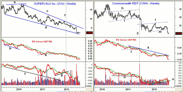
Chart Analysis: Supervalu (SVU) is a $478 million grocery store company that received some attention earlier in the year as a turnaround candidate, and also because of its attractive yield.
- The weekly chart shows that SVU peaked in early 2010, making a higher high of $17.89 (line a).
- At the time, the relative performance or RS analysis has forming lower lows (line b), which was not an encouraging sign.
- Since 2010, SVU shows a clear downtrend, as there is a pattern of lower highs (line c) and lower lows (line d). For income investors, buying a stock in a downtrend is a bad strategy.
- In the middle of 2011, the RS line broke to new lows, and by the end of January 2012, it started to drop more sharply (line 1).
- By early 2010, the weekly on-balance volume (OBV) had already started to make lower lows (line f), and this trend has continued over the past two years.
- The OBV broke support (line g) early in the year, and has since dropped 68%.
- SVU now yields over 16%, and still looks weak technically.
Commonwealth REIT (CWH) is a $7.4 billion office and industrial real estate investment trust that has been frequently recommended. It currently yields over 13%.
- In 2007, CWH traded as high as $54.68, before dropping to a low of $6.28 in 2008. CWH rebounded to a high of $33 in early 2010, but then dropped sharply.
- For most of 2010, CWH formed a trading range (lines h and i). This year-long trading range was resolved in July 2011 (line 2), and CWH dropped 33% in the next four months.
- The break in price support was confirmed by a drop in the relative performance below its support (line j).
- The RS line has been in a well established downtrend since 2010.
- The OBV broke its support (line n) in May, almost two months ahead of prices, and volume surged in July 2011.
- CWH formed a new trading range or continuation pattern from November 2011 through August 2012 (lines l and m).
- This trading range was completed last month, as CWH has dropped over 23% from the July highs.
- The weekly OBV and RS lines have both broken support, confirming the weak price action.
NEXT: Using Multiple Time Frames to Confirm Trends
|pagebreak|As I have frequently pointed out in the past, combing two different time periods can often help one fine tune their entries and exits.
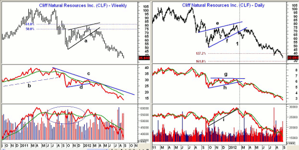
Another income casualty has been Cliffs Natural Resources (CLF), which is a $4.8 billion mining and natural resource company. CLF peaked at $102.48 in April 2011 and then made a secondary high in July at $102.
- CLF plunged to a low of $47.31 in October 2011, and the rebound failed in January 2012 below the 61.8% Fibonacci retracement resistance.
- The weekly relative performance had topped out by the fall of 2011, as the long-term uptrend (line b) was broken and the RS line was well below its declining WMA.
- The break in price support (line a) completed the flag formation in February. The break was confirmed by a drop in the RS line below its support (line d).
- CLF rebounded back to former support (line a)—now resistance—in March, which was a good selling opportunity.
- The weekly OBV stayed in a broad trading range for much of 2011, and was giving a misleading picture, as it was acting stronger than prices.
- The weekly OBV broke long-term support in April, and has since been leading prices lower.
The daily chart of Cliffs Natural Resources (CLF) more clearly shows the flag (continuation pattern) that formed from September 2011 through February 2012 (lines e and f). The formation was completed on February 17 (line 1).
- The flag formation had a 127.2% Fibonacci price target at $39 that was hit in late July, with the 161.8% target at $28.50.
- The daily relative performance confirmed the price action by completing its flag formation (lines g and h).
- The daily RS line has continued to make lower lows and lower highs.
- The daily OBV also confirmed prices by violating its uptrend (line i).
- CLF now yields 7.4%, as it was down over 17% in both July and August
- There is first resistance now at $38, and then stronger levels in the $42 to $43.50 area
What it Means: Those that bought any of these stocks earlier this year because of their yields have suffered some serious capital losses, which makes their formerly attractive yields now seem irrelevant.
Therefore, I would encourage income investors to at least take a look at the weekly charts of any income stock they are looking to buy. Those who want to go a bit further should also look at the RS and OBV analysis to see if they are supporting the decision to buy.
Lastly, have a plan in place for all investments, which includes at least a mental stop on all positions. And stick to your plan.
How to Profit: None of these three stocks look attractive, as any rebounds are likely to be met with further selling.


