A popular market breadth indicator, the McClellan oscillator is one of the tools that technician Tom Aspray has come to rely on over the years, and here he explains how he uses it, along with some formation examples.
The debate over whether it is possible to time the stock market has been going on for years and will likely continue into the foreseeable future. One of the difficulties in assessing the merits of market timing is that some of the analysis that goes into the determination is subjective rather than objective. This can make the testing of a methodology quite difficult.
Another key factor is the time frame that one is trying to predict. In other words, are you looking three months out? Six months? Years? Of course, the most difficult are the short-term forecasts as to whether the stock market is going to be up or down the next week.
Occasionally, you can make these with some degree of confidence but often only just after significant turning points when a top or bottom has been determined technically.
One of the key tools that I use to determine the intermediate- or long-term outlook is the weekly, as well as the daily Advance/Decline lines. I have written about their application extensively in the past (One Indicator Stock Traders Must Follow) and they play an important role is my daily and weekly analysis.
Tracking whether the NYSE Advance/Decline is moving with prices or diverging from them has been a valuable tool in determining bull and bear markets. Trying to determine whether a correction will last several weeks or several months is more difficult.
One indicator that I have found often to be very useful in identifying the end of market corrections is the McClellan oscillator developed by Sherman and Marian McClellan in 1969. Their son Tom McCellan has continued their analysis of the markets and is an excellent technician, who covers a wide range of markets. I have had the pleasure of knowing this “pure technical family” for many years and they provide a wealth of data, including daily readings of the market internals on their site.
In today’s Trading Lesson, I am going to share some examples of how I use the McClellan oscillator. My methods are likely to differ from Tom’s or that of other analysts. As I have repeatedly pointed out, a technical tool is only really valuable to another trader or investor if they study it enough to become convinced that it works. Only then will you be able to use it in real time.
The McClellan oscillator can be thought of as a momentum indicator of the A/D line as it looks at the difference between a 19-period and 39-period moving average of the net advances. Since the number of stocks traded has expanded so much in the past 20+ years, percentage values are now used instead of the raw number of advancing or declining stocks.
I have been following the McClellan Oscillator since the 1980s and want to share with you some of the formations that I have found the most valuable, as well as instances where I rely on other measures of the market internals.
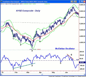
This chart of the NYSE Composite covers the period from January 2003 through June 2003. The McClellan oscillator (OSC) is plotted below the bar chart and the dashed black line notes the zero line, while the dashed red line is drawn at -150.
Multiple positive or negative divergences often provide the strongest signals and this is a classic example. The McClellan oscillator (OSC) had an initial low at -234 on January 27 (point 1) as the NYSE Composite closed below its daily starc- band.
NEXT PAGE: Examples of OSC Formations
|pagebreak|The OSC rebounded to -67 over the following seven days before it again turned lower. At the February 13, 2003, market lows, the OSC was at -175 (point 2) so the first positive divergence was formed. As the NYSE Composite made another new low on March 12 of that year and dropped below its starc- band (point 3), the OSC only dropped to -93. Therefore, a second bullish divergence was formed.
The OSC later moved above the zero line two days later, which confirmed that the low was in place. Seven days after the low, the NYSE tested the starc+ band with the OSC at +167. The market pulled back over the next few days as the 20-day EMA was briefly broken at point 4, but the OSC stayed well above zero. This was a good buying opportunity.
The NYSE rose over 8% in the next six weeks. The 20-day EMA was again tested in the middle of May 2003 as the OSC dropped below the zero line for three days before it again flipped to positive. The NYSE surged from 5200 in May of that year to 5700 on June 17, 2003, when the OSC formed a negative divergence, line 6, before the zero line was convincingly broken.
As the continuation of Figure 1 indicates, the OSC dropped below the zero line on June 18, 2003 and stayed below its for the next seven weeks. Ten days after the high the NYSE came close to the starc- band and the OSC spiked to a low of -226. The rebound in the OSC failed below the zero line, indicating that the correction was not yet over.
The chart shows that the NYSE then formed a nice triangle or flag formation, lines a and b over the next month. In July of that year the OSC dropped to -244 while at the early August low it was a bit higher at -240 (see arrow) so a slight positive divergence was formed. The downtrend in the OSC, line c, was broken on August 7, 2003, the day after the low.
The OSC overcame the zero level four days later on August 12, 2003, line 1. The OSC peaked in early September of that year at +196 and then formed lower highs while the market continued higher. Those who have read my prior articles on Fibonacci targets know that I use the 127.2% retracement level of the flag formation to determine initial upside targets.
For the NYSE, this level was at 5835.76, which was exceeded on September 18, 2003, point 4, as the high was 5850. Two days after the highs, the OSC dropped back below zero (line 2) and the market declined for the next five days. Those with orders in the market were able to sell part of their position at the price target but trading the short-term pullback would have been more difficult.
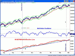
The market closed strong on October 1 of the same year as the OSC moved back above the zero level (line 3). As the chart indicates, the NYSE was in a clear uptrend into the latter part of November 2003 but the OSC moved above and below the zero line several times.
Over the next five months, the OSC moved through the zero line at least 15 times, and while a nimble trader might have been long only when it was rising and short or out when it was declining, the market’s trend was clearly positive.
Below the OSC, I have included the NYSE Advance/Decline, which by October 2003 was in a solid uptrend, line a. Though the 21-day WMA of the A/D line was briefly violated three times, the uptrend was not broken until February 23, 2004. When the OSC is choppy, I always defer to the A/D line analysis.
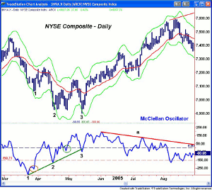
From the March 2004 high to the May 2005 low (point 3), the NYSE Composite lost over 7.4%. On March 16, 2004, with prices testing the starc- band, the OSC hit a low of -331. It formed a very short-term divergence three days later (see circle) before rallying to +79. This bounce just retraced a bit over 38.2% of the prior decline suggesting that the correction was probably not over yet.
NEXT PAGE: More Examples of OSC Formations
|pagebreak|On April 15, 2004, the OSC made a higher low at -181 as the NYSE closed below its starc- band. The NYSE tested its lows nine days later but the OSC was only at -37 (green circle). The ensuing rebound was sharp but failed seven days later as the NYSE dropped to new correction lows at point 3. The OSC broke its uptrend on this new price low as it dropped to -49 but was still acting stronger than prices.
This could have been a tough one especially for position traders who were using a stop tight under the prior lows. It may have been tough to get back in the next day when the OSC moved back above the zero line.
This action was more typical of the stock index futures where you will sometimes see a sharp drop to clean out the stops before the market reverses. For short-term traders who bought after the divergence at point 2, taking partial profits would have mitigated the damage.
The next four months were a period where, again, the OSC moved above and below the zero line many times while the A/D line gave a clearer indication of the market’s actual trend.
The A/D line did form two positive divergences at the April-May 2004 lows, line c. This divergence was confirmed on May 18, 2004, (line 1) when the A/D line moved through the resistance at line b. In late June of that year, the A/D line dropped briefly below its WMA, but by early July, it was again making new highs.
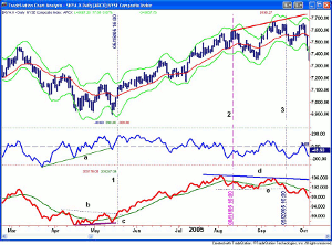
The NYSE A/D line made a high on August 2, 2005 and then dropped below its WMA. As the NYSE Composite was making a new high on August 11 of that year (line 2), the A/D line was only able to rally to its flat WMA, therefore not confirming the price action. This was an early warning sign.
The NYSE Composite made new rally highs on September 12, 2005 but the A/D line did not make a new high, line d. This longer-term bearish divergence was confirmed when the A/D line dropped below its support, line e, on September 20, 2005 (line 3).
The NYSE Composite rallied back towards the previous high in late September of that same year and the OSC just briefly moved above the zero line. The A/D line was just able to test its declining WMA, which was a sign of weakness as it then turned lower.
Looking at more recent data from only a few years prior, I wanted to provide you with more examples of what type of formations you may see in the McClellan oscillator as rarely will you see two that are exactly the same, though they sometimes share some common characteristics.
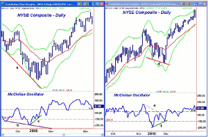
The NYSE Composite chart on the left side is from the fall of 2005 where you can see that the market made a series of lower lows, line a. At the initial low, the OSC hit -184, and then in October, it made a lower low with prices (line b) as it reached -241 on October 13.
The most reliable signals I have found are the positive divergences that form over a three-four-week period so the lower lows in the OSC may have made one think that the market would not bottom for several more weeks.
Just five days later, the NYSE Composite made a new low but the OSC did not (line c) as it was at only -121. Two days later, it moved above the zero line, which was the start of a seven-month rally. The ability of the oscillator to move above the early October high supported the bottom scenario
The formation in the fall of 2010 was more typical as stocks had rallied sharply from early September when the A/D line had broken out to new highs. In early November, 2009, the NYSE Composite tested the daily starc+ band before turning lower. Just seven days later, the starc- band was being tested and the OSC had dropped to -245.
As is typical when prices are at the starc- band, the NYSE rebounded for a few days before again turning lower. After just eight days, the market was again making new lows, line d, but the OSC was forming a bullish divergence (line f) as it only dropped to -141. One day after the low, the OSC broke through its downtrend (line e) and the following day was in positive territory completing the bottom formation.
NEXT PAGE: OSC More Reliable at Market Tops
|pagebreak|The overall market finished about flat in 2011, so in 10-15 years that will make it seem uneventful but most of us will remember it quite differently. After topping in May 2010, the market had a pretty normal correction into June before turning higher into July of that same year.
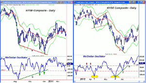
Few thought that our leaders in Washington would let the debt ceiling debacle implode but they did and stocks plunged from the latter part of July into early August 2010. The OSC reached a low of -424 on August 8 before rebounding to +153 by early September of that year.
Historically, September is a rough month and 2011 did not disappoint as the market plunged to new correction lows in late September and again in early October, line a. The market sentiment at the time was very bearish as many thought we had started a new recession but the OSC was telling a different story.
On September 22, 2010, the OSC hit a low of -199 and then on Tuesday, October 4 of that year, as the market plunged in early trading before reversing, the OSC closed at -91 (see arrow). This two-month bullish divergence, line b, was a very positive signal for the overall market that was confirmed by the A/D line.
There was another very bullish bottom formation in the early summer of 2012. The market had shown signs of topping in late April as the daily A/D line had turned lower and moved into the correction mode.
In late March and early April 2012, the OSC’s double failures at the zero level (see arrow) set the stage for the drop to an OSC low of -298 (point 1) and a close below the starc- band. The rebound took the form of a continuation pattern and only the Dow Industrials made new highs on May 1, 2012.
The selling in May was much heavier as on May 18 of that year the OSC dropped to -329. After moving sideways for five days, prices again plunged to new correction lows and reached the starc- band. At the June 4, 2012 low, the OSC was at -123, which completed a strong positive divergence (line d). As I wrote on June 6, 2012, this set the stage for a rally the bears were not expecting.
The McClellan Oscillator and Summation Index, which is a cumulative total of all oscillator readings can be found on a number of free Web sites. It might be helpful to write down daily readings for a while to give you a better feeling of how it changes. When I first started using it, I plotted it manually. Be sure to draw lines as they are very important.
As you can tell from my historical examples, I have found the McClellan oscillator to be more useful at market bottoms than tops and in strongly trending markets, I rely more heavily on the A/D line. I know that many times when the majority were saying sell, the McClellan oscillator had me buying, so I will always be thankful to the McClellan family for this excellent tool.
[Editor’s Note: The Complete Guide to Market Breadth Indicators: How to Analyze and Evaluate Market Direction and Strength by my old friend Greg Morris is the most complete reference guide on A/D indicators.]

