While fundamentalists delve into economic and financial data to analyze the market, technicians employ indicators, so Tom Aspray details how he uses a combination of them in his daily analysis.
The starc bands are a technical tool that I use frequently. They help me determine whether a market is in a high risk buy area (overbought) or a low risk buy area (oversold). It is important to understand that just because a market is at its starc+ band, the market can still go higher but the probabilities do not favor it.
The regular formula, developed by the late Manning Stoller, adds or subtracts two times the average true range (ATR) from a six-period moving average. In his experience, a market should stay within these bands approximately 92% of the time. If instead you use three times the ATR, then prices should stay within the bands 99% of the time.
These bands are valuable on any stock, ETF, or market average but there is another tool that I use to help me determine when the overall market is overbought or oversold. This is the number of stocks in an average that are above their 50-day moving average. Of course, you can also look at this number relative to a 10- or a 200-day moving average.
This data is widely available on the Web, but a few years ago, I came across a great site Index Indicators, which has an amazing number of free technical indicators. They have data not only on our exchanges but also on Canada, ten different European indices, 11 Asian/Australian markets, as well as Brazil, Mexico, and Argentina. (I have no idea who developed this site but the data seems clean. Of course, I have no financial connection with them).
A word of caution, if your significant other or family becomes aggravated when you spend long hours on research, this site could be a problem as you can easily spend hours, if not days, using it. In this lesson, I want to focus on how I use one small part of the data that they provide.
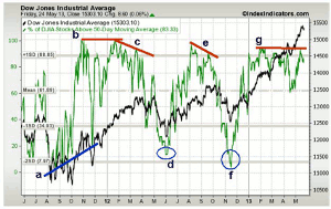
This chart features the Dow Jones Industrials and overlaid in green is the % of Dow stocks that were above their 50-day moving average during this 2-year time period several years ago. I have found this information to be most valuable at market bottoms. The annotations on the charts and the analysis are mine and are not from of the site.
I am sure everyone remembers the fight over the debt ceiling debacle in the summer of 2011 as stocks started plunging in late July and remained very volatile for the next two months. Many became convinced that another recession was imminent and bearish sentiment was very high.
During the drop in early August of that year, the % fell to zero, and then formed higher highs, line a, at the October 2011 lows. The % rose to 13% at the October 4, 2011 lows, and a few days later, the A/D indicators turned bullish. I find that combining the A/D analysis with this data can be a powerful tool to identify market bottoms.
NEXT PAGE: What Divergences Signal
|pagebreak|In November 2011, stocks dropped sharply the week of Thanksgiving and the % spiked down to 20%, which turned out to be a great buying opportunity. The Dow continued to make new highs, and by the middle of January 2012, the % had reached 100%, which was equal to the October 2011 high, line b.
As the Dow was making its high in March 2012, the % was forming a lower high at 90 (line c) and this negative divergence became more pronounced as the Dow made its high on May 1, 2012. By the early part of June of that year, the % had plunged to 13 (point d) while the A/D indicators were forming bullish divergences as I noted in Rally Potential That Bears Don’t Expect.
By early August 2012, the % of stocks was again close to 95% but formed a lower high on September 14 of that year as stocks were peaking. The negative divergence, line e, warned of the correction that lasted until just after the 2012 election. At the November 16, 2012 low, only 3% of the Dow stocks were above their 50-day MA.
Several times in 2013, the % has reached 93%, line g, but has not made higher highs even though the Dow Industrials had made a series of new highs. A drop below the 60% level could have signaled that a correction was already underway that year.
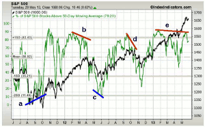
The chart of the S&P shows some similarities to that of the Dow, as well as some differences. The % of stocks also formed a bullish divergence, line a, at the October 2011 lows and then spiked to over 90%, which was a sign of strength. This and the new highs in the NYSE A/D line indicated that the correction in November was a buying opportunity.
The sharp pullbacks in the % to oversold levels when the A/D line is in the early stages of an uptrend are generally good risk/reward buying opportunities.
In February 2012, the % peaked at 88, but by March of that year, it had made a lower high at 82, line b. By the end of April 2012, it dropped further. In late May and early June of the same year, it made lower lows, line c, as no bullish divergence was evident in the %. It should be noted that the % did drop to two standard deviations below the mean signaling a very oversold market.
Even though the % of stocks formed sharply lower highs in October 2012, line d, this was not a divergence since the S&P 500 also made lower lows. By the middle of November 2012, as many thought a new bear market was underway, the % dropped to a low of 23%. They ignored the fact that the NYSE A/D line had confirmed the highs, which meant that the intermediate trend was still positive.
As another example, in 2013, the % peaked in January at 91 and in May was slightly lower at 90, line e. Another new high in the S&P 500 was then likely to be accompanied by a lower peak in the % of stocks above their 50-day moving averages. Oftentimes, multiple negative divergences form before a top is completed.
NEXT PAGE: Backtesting Indicators
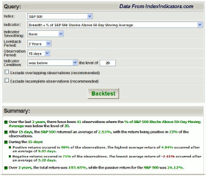
|pagebreak|The Web site also allows you to backtest the % of stocks, as well as all of their other indicators. This table reflects the results of a test on what happened to the S&P 500 for the 15 days after the % dropped below 20. This has happened 41 times in a two year-span from 2011-2013.
After 15 days during that time frame, the average gain was 2.53% and the return was positive 77% of the time. It also noted that during the 15 days, the highest return was 4.84%, which occurred at an average of 9.83 days. Its lowest average was -2.41% that occurred 5.29 days after the 20% level was breached.
Their test data suggests that the total return was almost four times better than the buy-and-hold return during the same time period. The site can also provide more current data, although what I have mentioned is still relevant from a historical perspective. They also provide you a listing of all of the signals, which I have not included either. However, though this test data is interesting, it is not the way I use this indicator.
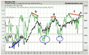
The Nasdaq 100 was a leading sector in early 2012 as the relative performance analysis indicated it was outperforming the S&P 500. The RS analysis turned negative in September 2012 but then turned around the following spring. The % of stocks analysis can often help confirm the relative performance analysis.
In early August 2011, only 2% of the Nasdaq 100 stocks were above their 50-day MA while in early October of the same year the reading was 13% as the % formed significantly higher lows, line a. After surging well above the 80 level in October and early November 2011, the 20% level was broken on Black Friday of that year.
From the November 2011 lows, the Nasdaq 100 rose 30% by the late March 2012 highs. The % of stocks peaked at 93% in early February of that year but only reached 85% at the end of April 2012, line b. A month later, the % had reached quite oversold levels at 10% (circle c.).
There were not any divergences at the September 2012 highs as the % made slightly higher highs, line d. The 20% level was tested in November 2012 (circle e), but by the end of January 2013, it was back to 90%. On May 21, 2013, only 85% of the Nasdaq 100 stocks were above their 50-day MA, so then lower highs, line f, formed.
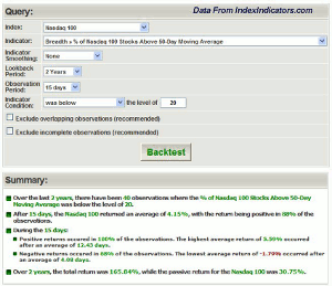
The backtest summary revealed that the % dropped below 20% 40 times in the that two year-time period, and after 15 days, the average return was 4.15% with a positive result in 88% of the time.
The best return occurred after 12.43 days and was 5.59%. The lowest average return of -1.79% occurred after an average of 4.08 days. The total return of 165.84% was over five times better than the passive return. Of course, there are many ways to change the backtesting as you can change the market average or indicator, smooth the indicator with a five-, 10-, or 20-day moving average, select the observation period, as well as the level of indicator that will trigger a signal.
NEXT PAGE: Signs of Weakness
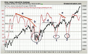
|pagebreak|This three-year chart of the Dow Industrials from 2010-2013 has the % of stocks above their 50-day MA smoothed by a 20-day MA (in red). As you can see, the 20-day MA was rising strongly by July of 2010, which was well before the market bottomed in early September of that year. The MA peaked in November 2010 and formed a series of lower highs (line a) as we moved into 2011 and the Dow made higher highs.
The divergence was even more extreme in July 2011 (line b) just before stocks collapsed over the debt crisis. At the market lows in October 2011, the 20-day MA was already rising (circle c) and peaked well ahead of prices in February 2012. The drop in the MA below the support at line d, was a sign of weakness.
In June 2012, the MA made a nice v-shaped low (point 1) and then peaked in late August. This was an early warning of the September top. In early October 2012, it formed a negative divergence, line e, as the Dow Industrials made slightly higher highs but the % formed lower highs. By the middle of December of that year, the 20-day MA was clearly rising, which coincided with the upside breakout in the NYSE A/D line.
In 2013, the MA rose once more after forming an initial peak in February. A drop below the early May low would have been a sign that the Dow had become weaker internally.
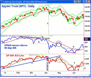
Of course, there are several ways to look at the same data. In TradeStation, you can easily plot the number of issues in the S&P 500 that are above a specific moving average. This chart had the number of S&P 500 stocks above their 50-day MA in 2012 along with its 34-period WMA (in red). It’s plotted below the Spyder Trust (SPY) and the S&P 500 A/D line is on the bottom.
As I had noted previously, the number of stocks peaked early in the 2012 and then formed lower highs, line a, in March and April of the same year. The drop below the support at line a, occurred on April 9, 2012 (line 1) and was a sign the market was getting weaker.
This also coincided with a break of the uptrend (line c) in the S&P 500 A/D line. Both rebounded in early May of that year (see circles) with the A/D line just reaching its former uptrend, which was then resistance. The selling increased over the next few weeks.
In early June 2012, the SPY reached its daily starc- band and was oversold. The number of stocks above their 50-day MA did make lower lows, line e. The A/D line made higher lows, line g, thereby forming a bullish divergence. The bottom was confirmed when the intervening highs in both indicators, lines d and f, were overcome.
As the market then began its next corrective phase, it was important to monitor these values as oversold readings combined with bottoming signals from the A/D line and the on-balance volume (OBV) can help you identify the next market low. As I first mentioned in 2013, this is generally a time when the risk on new long positions is favorable as bearish sentiment on stocks is often quite high.

