Even master technicians had simple beginnings, and these insights and real market examples are intended to help beginners develop the skills to analyze charts and spot opportunities in the markets.
Over 30 years ago, when I started studying stock charts, I worked exclusively from printed chart books from either Mansfield or Daily Graphs, both of whom are still printing charts.
The leading book on technical analysis at the time was Technical Analysis of Stock Trends, by Edwards and Magee. My learning curve consisted of reviewing literally thousands of charts in the early years, drawing multiple trend lines, and then observing what happened.
Chart analysis can be fairly subjective, and I have often been asked during seminars "Why did you use this trend line instead of another one?" Therefore, I thought that an explanation of how and why I draw trend lines might be helpful to beginning chartists, as well as provide the more experienced chart readers with some additional perspective.
First of all, it should be noted that in preparing charts for my regular articles, I often start out with a series of trend lines, but only include one or two in the published chart. I realized early on that it was often better if I did not know much, if anything, about the company when doing my analysis, because that kept me more objective. Therefore, in the first few examples, I will not reveal either the company name or the time period I am reviewing.
Figure 1
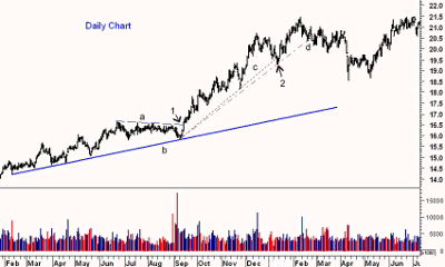
This daily chart allows me to share some examples of the key guidelines that I follow when analyzing a market. The first guideline is that time is important. The longer it takes to develop a trend line or area of support or resistance, the more important that level is to the market's trend.
The second guideline is that the greater the number of points that can be used to identify an important support or resistance level, the more likely it is that prices will respect that level. The uptrend, line b, is drawn using the February, March, and April lows. The low in May was $15.13, which was comfortably above the trend line at $14.96. The low in September held just a few cents above this support.
A common mistake I notice when working with some short-term traders is that they use a five-, 15-, and 60-minute chart, and though they may have a daily chart on their screen, it is not studied as rigorously as the other time periods. When this is pointed out, the answer is that they were just looking for set-ups on the 15- and 60-minute charts. The problem with that is sometimes an intraday set-up will come at an important level on the daily chart that limits its chance of success.
From the June and July highs, one was able to identify a level of resistance, line a, that was also tested in August and approached in early September. The stock then dropped sharply to test the uptrend, but held above the June lows, which was a reason to stay positive on the stock.
Though the breakout was accompanied by better-than-average volume, it was less than what was observed on the prior decline. Ideally, this is not what one wants to see. Nevertheless, prices held above the breakout level for the following two days, suggesting the uptrend had resumed.
The stock made a series of higher lows and higher highs over the next few months, but the short-term uptrend that might have been derived from those lows was violated on the drop in November. This was then a good focal point for a new uptrend (line c).
Prices held above this support (line d) until early February, as the daily chart developed a pattern of lower highs and lower lows. This made the short-term trend negative, but as long as the long-term support (line b) held, the intermediate trend remained positive.
NEXT: Spot Key Trends on the Weekly Chart
|pagebreak|Figure 2
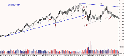
This weekly chart is of the same stock and starts just as prices had broken through the resistance from the previously discussed February highs at $21.46. On the weekly chart, I have drawn an uptrend from the low in September at the far right and the April low, giving me line a.
By late May, the stock was again making new highs and peaked in July before undergoing a sharp setback in August. It was then possible to draw a steeper uptrend, line b, using the April and August lows. This support held until August of the following year, point 1.
The stock attempted to stabilize after closing below this weekly support but then continued lower for the next nine weeks, which confirmed that the uptrend was important. The stock lost another 18% after the weekly close below line b.
The longer-term uptrend, line a, did hold on this decline. Just eight weeks after the lows (point 2), the stock had made new rally highs, signaling that a new uptrend was underway. The stock moved sideways early the next year, making a series of successively minor lows. In April, it dropped to $54.45 early in one week, but then reversed to close at $63.78, above the highs of the prior ten weeks.
This type of action is generally quite significant, and a new uptrend, line c, was drawn using this low. Further new highs were made in July at $72.28 before a correction took prices back to the support at line c. The stock's failure to make new highs on the next rally was an early sign of weakness. The uptrend was broken a few weeks later (see circle), but the weekly close was above the uptrend.
I have found that it is a close above or below an uptrend or downtrend that is more significant than if the trend line is broken during the week. If a weekly uptrend is broken during the week, it can often be an early warning sign, and I then try to monitor the action more closely.
The stock made a marginal new high at $75.37 in October, then moved sideways for several weeks before gapping (point 3) through the support at line c. Gaps above or below weekly trend lines are almost always significant and demand that one either close out their position or use very tight stops.
Both the August and October lows were violated the following week, suggesting that a pattern of lower lows and lower highs was developing. Confirmation of a change in trend came several weeks later when the long-term uptrend, line a, was broken (point 4). The stock accelerated to the downside, eventually reaching $40.36 in early March (point 5).
From this low and the July-to-September lows, a new uptrend, line d, could be drawn, but this was no longer a bullish chart. This support was more important for those who wanted to trade a further decline because a top was already in place.
The stock made it all the way back to $71.21 by December, which allowed those who stubbornly stuck with their long positions to get out. The reversal from these highs and the break of support at point 6 indicated a resumption of the downtrend. Using this high, it was possible to draw a new downtrend, line e, which is still intact ten years later.
NEXT: Discover the Identity of This Mystery Stock
|pagebreak|Figure 3
I purposely left out the name and date range for the stock in Figures 1 and 2 since I was trying to point out the importance of being objective with your chart analysis. The stock in both charts was Bristol-Myers Squibb (BMY). Figure 1 covers the period from February 1995 through June 1996, while the weekly chart covered the period from March 1996 until June 2001.
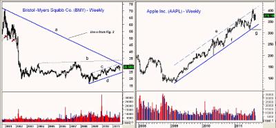
I did not want to influence your chart reading by calling up any memories you might have of the bull market top in 2001. The downtrend, line e, from Figure 1, is still intact and is now at $30.86. It is labeled as line a on the current weekly chart.
BMY has developed an up-trending channel from the 2009 lows, lines c and d. If the major downtrend is surpassed, there is also significant resistance at $34.70, line b. A break of support at $24.30 (line d) will suggest another leg to the downside for BMY.
Apple Inc. (AAPL) is clearly a market bellwether, which makes it an important stock to keep an eye on even if you are not trading it. The 2009 and 2010 lows allow us to draw a long-term uptrend, line f, as well as an upper trading channel, line e. I find trading channels can be very useful, as often times, stocks will test the upper boundaries of the trading channel, which will also correspond to the weekly Starc+ band, indentifying a potential turning point.
- See "Gain an Edge with Volatility Analysis" for more on Starc bands.
AAPL surpassed both the weekly Starc+ band and line e during the week ending July 30 when it surged to a high of $404.50. Since this high was significantly above the prior high at $360 in February, there are no signs that the powerful uptrend is weakening.
The stock also held the uptrend (line e) in June with the low at $310.50 (line g). This now becomes the first key level of support to watch. If it is broken, the focus will turn to the support from the 2010 highs at $280.
Figure 4
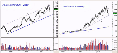
Amazon.com (AMZN) is another stock that has led the market on the upside since the 2009 lows. The primary uptrend, line c, was clear in September 2010, as it was drawn from the late-2008 and the July 2010 lows. This allowed one to draw an upper parallel trading channel, line a, from the December 2001 high at $145.91.
The upper channel acted as strong resistance in January and May 2011. It was surpassed in August 2011 as AMZN surged to a high of $227.45. The decline from this high has been quite sharp, as the shorter-term uptrend, line b, was broken on a closing basis the week ending August 19. The June lows at $181.59 have also been broken.
This makes the mid-March lows at $160.59 a pivotal level to watch. A look at the daily chart of AMZN (not shown) indicates that it will take a close above the $205.60 level to stabilize the weekly chart.
NetFlix Inc. (NFLX) has also been a powerful performer, and since the November 2008 lows at $17.90, the stock rose to a high of $304.79 in 2011. The long-term support from the lows, line f, is well below the market at $88.40.
The steep uptrend, line d, was drawn from the July 2010 and the March 2011 lows. It was broken on a closing basis the week ending July 30. It is also a concern that the multiple weekly lows from April 2011 at $224 have been broken, as NFLX made a recent low of $205.
The nearby uptrend, line e, is derived from the January 2010 and July 2010 lows and is currently at $194. If this support and the March low at $188.89 are violated, a decline to the $150 area becomes likely. NFLX needs a weekly close above the $250 level to avoid a decline to the support in the $150 area.
NEXT: Tom's Updates for 2012
|pagebreak|2012 Updates
This article was originally released on August 25, 2011, but the basic concepts of chart reading are applicable to the charts of tomorrow as well as historical charts.
Since I am out this week, I thought it might be interesting to update the charts of Bristol-Myers Squibb (BMY), Apple (AAPL), Amazon.com (AMZN) and NetFlix (NFLX) to see if last summer's trend lines were relevant to the price action since August 2011.
Figure 5
At the time of the original article last August (line 1), the long-term downtrend for Bristol-Myers Squibb (BMY), line a, was at $30.86. By the middle of September, it had declined to just above the $30 level. The week ending September 17, it was overcome with the weekly close at $30.56. By the end of the year, BMY surged as high as $35.44 and broke out above the trading channel, line c. The resistance at $34.70, line b, was therefore overcome, and it has provided support in 2012.
In August 2011, the weekly chart of Apple (AAPL) showed a well established trading channel, lines e and f. In October and November 2011, AAPL came close to its major uptrend, line f. AAPL hit a low of $363.32 just after Thanksgiving, before accelerating to the upside. It held well above the important level of support at $302 that was identified last August.
The upper channel was overcome in early February, as AAPL shot to a high of $644 in April. The pullback from the highs dropped AAPL back to $522, which was well above the channel support, line e, which is now at $502.
Figure 6
Amazon.com (AMZN) had broken the uptrend, line b, as the original article was released (line 1). This made the March 2011 low at $160.59 the key level to watch, and AMZN held well above it, as it made a low of $177.55. AMZN rallied sharply from these lows, moving well above the upper trading channel, line a, and reached a high of $246.71 in October.
The correction from these highs was quite sharp, as AMZN dropped 30% from the highs and tested the long-term uptrend, line c. The late December low at $166.97 is now the important level to watch. The weekly chart for AMZN now shows a clear uptrend, with next resistance at $233.84, which was the May high.
Lastly we have NetFlix (NFLX), which was one of the big stock stories of 2011. At the end of July 2011, the steepest of its weekly trend lines, line d, was broken. Just over a month after the original article release (line 1), the further support in the $194 area, line e, was also violated.
The next level of support at $150 provided little support, as NFLX continued to crash-losing 69% in just eleven weeks. The next support at $150 was quickly broken, as was the long-term support at line f. NFLX eventually hit a low of $62.37 in December 2011. The February high at $133.43 now must be overcome to complete the potential double-bottom formation.
Conclusion
I hope you have found this introduction to
chart reading helpful, and that it may have changed your approach to chart
analysis. I would suggest that new chartists begin with the weekly chart and
draw multiple lines before deciding which ones are the most important. Then, try
to isolate either uptrends or downtrends that are derived from more than two
points. Only after you have completed your weekly analysis should you go to the
daily charts to determine whether the two time periods are in agreement.
Once you have gone through many charts, review them later to see if the levels you identified were indeed important. At that point, you might want to consider adding relative performance, or RS analysis, or on-balance volume (OBV) analysis to see if it helps you get a better idea of a market's direction.
Experienced traders, consider printing out weekly charts of the market(s) you are trading and then use a ruler to analyze the charts. It's possible that this will give a different perspective than drawing trend lines by computer.


