This year’s price action in popular financial ETF XLF shows how combining Bollinger bands with moving averages on the charts can give powerful signals about market strength and direction.
Financial stocks have shown relative weakness to other sectors, as evidenced by the lackluster performance and recent support breakdowns in the leading financial sector ETF, the Select Sector SPDR - Financial (XLF).
Let’s take a daily and then a weekly view to learn lessons from the structure and see current reference levels to watch.
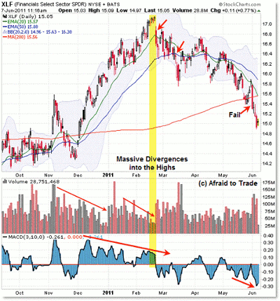
First, the daily chart (notice the arc pattern):
Let’s start first with a trading lesson in terms of the divergences at the high in February ahead of the reversal.
This is a good reference example of how negative volume and momentum (3/10 oscillator) divergences served as broad non-confirmations of the new recovery high at $17.00 per share.
Notice the string of five doji (reversal) candles that formed into the upper Bollinger band at this time.
If you see this pattern (reversal candles into the upper Bollinger band when price is undercut by lengthy negative divergences) in real time in the future, take profits quickly!
Aggressive traders could consider setting up a reversal play into this structure, or (preferably) on confirmed price breakdowns of rising trend lines or moving averages. If you miss the perfect entry, don’t sweat it, we all do; there’s almost always two or three good entries into a swing move like this.
I’m showing two of them in terms of the first breakdown of the rising 20-day exponential moving average (EMA) with an impulse candle on February 22. The other safe opportunity was on the breakdown under the rising 50-day EMA on March 14 and 15.
Price flagged (bear flag) its way down to the target level of the 200-day simple moving average (SMA) and November 2010 price high, which I showed in the post “Triangulating FAS Challenges Critical Support” (while FAS is different than XLF, the structure on the chart was similar at the target test level).
After a four-day rally into EMA target resistance off the critical support level, sellers pushed the financial ETF back under the rising 200-day SMA and swing low, creating a “failure to rally” signal (or successful breakdown, depending on your perspective).
NEXT: See Important Price Action on the Weekly Chart
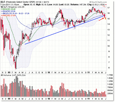
|pagebreak|It wasn’t just the 200-day SMA that was important at the $15.45 level, however. It was a long-standing rising weekly trend line on which price initially supported that broke last week:
Starting with the June 2009 swing low, we can draw a trend line up that connects three additional swing lows in the context of the recent recovery/rally.
Price broke down under that rising trend line last week at the same time it sliced through the rising 200-day SMA.
Cutting right to the chase, XLF takes a bearish confirmation turn as long as it’s under this trend line and the 200-day SMA, both of which are currently converging at $15.60/$15.80.
The classic chart expectation would be to look for further price deterioration, and the alternate scenario would be to expect a bullish surprise or short squeeze should the ETF rally back above $16.00 (to be safe and to have an easy-to-remember reference level).
Lower targets include the $14.30 area (November 2010 low), and beyond that is the 2010 triple-tested lows at $13.20.
In other words, unless buyers pull off a big surge to the upside soon and bust this recent bearish development, the “path of least resistance” will prevail.
By Corey Rosenbloom, trader and blogger, AfraidToTrade.com


