Here are some charts I like to keep an eye on. I’m pricing the Dow Jones Industrial Average (DJI) in alternative assets like ounces of gold, barrels of oil, bitcoin, etc., suggests Rocky White, technical expert at Schaeffer's Investment Research.
Hopefully, this can help us catch rotations into or out of these assets as early as possible. Also, we can visualize the opportunity costs of stock investing compared to these assets.
For example, when the Dow began making new highs in 2013, it was still down 75% (when priced in ounces of gold). Investors buying stocks with their cash reserves probably felt fine, but anyone selling gold to buy stocks most likely felt a lot of regret.
Stocks Priced in Precious Metals
Here is a chart of the Dow along with gold ($/Oz) since 1975. Gold topped out in 2011 after a meteoric rise, and then tumbled over the next few years as the Dow rose significantly.
The Dow accelerated even higher as gold hit a multi-year low in 2015. Since 2018, stocks and gold both spiked, and despite the coronavirus pandemic and the recent stock market selloff, both assets are significantly higher now compared to 2018.
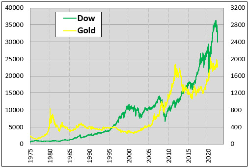
When the assets move in opposite directions, it’s easy to know which one did better. When both move in the same direction, it depends on the magnitude of the move, which is harder to see on the chart above.
The chart below makes it clearer. It’s a chart of the Dow, except instead of being priced in dollars, it’s priced in ounces of gold. When the line moves higher, the Dow would be the preferred investment. When it’s moving lower, gold would be preferred.
I also have the long-term average and median price of the Dow on the chart for historical reference. From mid-2011 through mid-2018 the Dow soared from 5.84 ounces of gold to 22.3, an annualized rate of return of 21% in those seven years.
Since then, the Dow pulled back to its long-term average of about 13.5 ounces, then bounced higher and now sits just above 16 ounces of gold. It will be interesting to see how these assets behave as we enter what looks to be a higher inflationary environment compared to what we’re used to and the Dow/Gold ratio near its long-term average.
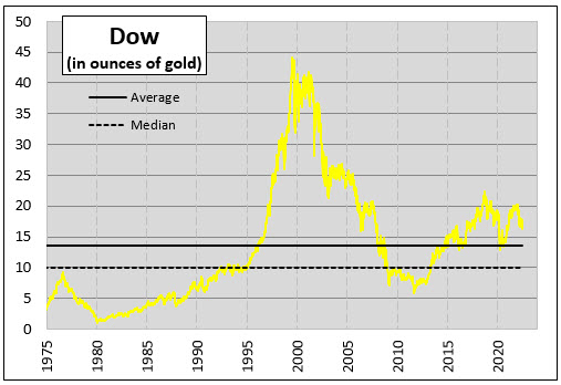
Pricing the Dow in ounces of silver looks a lot like the chart above. The rise from mid-2011 through mid-2018 was even more steep when priced in ounces of silver with an annualized return of 32%. Thus, the Dow, when priced in gold, sits about 20% above its long-term average. When priced in silver, it’s close to 60% above its long-term average.

Stocks Priced in Other Commodities
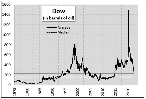
If you’re not valuing the Dow in dollars, then gold and silver are the natural choice. They have been used as currencies in the past. You can, however, value the Dow in anything. The chart below shows the number of barrels of oil it would take to buy the Dow.
In the early stages of the coronavirus, most of us recall stocks crashing. If our currency was barrels of oil, however, it was a short-lived stock market bubble. Oil crashed so hard that some futures prices went negative as producers, lacking a way to store the oil, were paying buyers to take the oil.
Things have changed and now and the Dow is down 80% when priced in barrels of oil, since that ridiculous peak at the height of the pandemic. Currently, it would take 273 barrels of oil to purchase the Dow, which is 22% above its average since 1975 which puts it in line with gold.
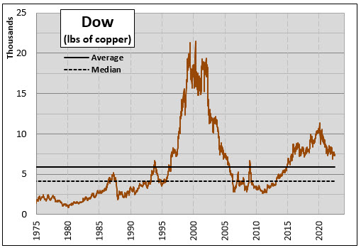
Copper is often referred to as Dr. Copper because, according to Investopedia, it is said to have a Ph.D. in economics and can predict turning points in the global economy. The chart below prices the Dow in pounds of copper. This chart is also declining since the pandemic as copper outpaced stocks after the bottom in March of 2020 and has held up better recently during the stock market selloff. The Dow, in pounds of copper, sits 27% above its long-term average.
Bitcoin
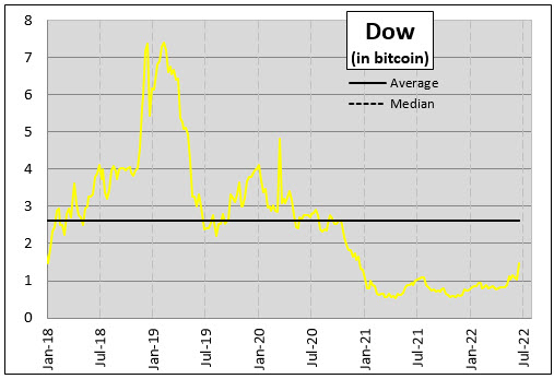
Before we look at a summary, let’s see how the Dow has performed in Bitcoin (BTC). I have bitcoin data back to 2015 when it took about 80 bitcoins to buy the Dow index. After bitcoin’s meteoric rise, the Dow is now worth less than two BTC. Since the pandemic, the Dow is up 171% when priced in bitcoin. It’s still 43% below its long-term average.
Summary
Here’s a summary of how the Dow performed over the past 52 week priced in these other assets. Also, I show where the Index stands compared to its long-term average. Investors lost about 10% over the past year holding the Dow Industrials Index.
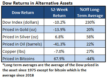
If investors would have given up gold for the index instead of dollars, they would have lost 14% of it. Had they traded in silver, on the other hand, they could have about 7% more. Silver is an outlier when compared to gold, oil and copper.
The Dow sits 60% above its long-term average when priced in silver but just over 20% above its average when priced in those other three assets. Does this suggest silver is undervalued? Silver needs to outperform those other commodities for that figure to be more in line with the others.


