Yearly charts usually get far less attention than their shorter brethren, but they still have useful lessons to give smart investors. MoneyShow's Tom Aspray analyzes the yearly trends for these four major asset classes to point out what levels you should be watching as we move into 2013.
Some investors, as well as quite a few traders, might be surprised to learn that many successful long-term traders pay considerable attention to the yearly price ranges of the key markets.
This is particularly true of a trader’s favorite markets, as many have these data points memorized. With just over one month left in 2012, we are able to see which markets have significantly changed since 2011.
As a year progresses, the opening range gains additional importance. This price gives one a broad view of where demand exists, as if prices are below the year’s opening, most who bought during the year are now holding a losing position. This creates a level of resistance or supply above the market.
A higher year-to-year close is also a big-picture positive, just like a lower yearly close can be a measure of downward momentum for the coming year. I think a closer look at the yearly charts will demonstrate why they are important, and can also help you identify the key levels for stocks, gold, the dollar index, and crude oil as we head into the new year.
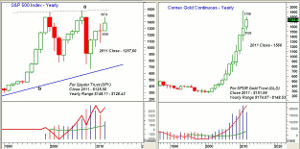
Chart Analysis: The yearly chart of the S&P 500 covers both recent bear markets, 2000 and 2008. In 2000, the S&P closed the year lower at 1,320.28, but well above the year’s low of 1254.57.
- In February 2001, the S&P 500 dropped below the 2000 low, closing the month at 1,239.
- In September 2001, the S&P 500 had a low of 1,040.94, so the break of the year’s low in February provided a good warning. By September 2002, the S&P 500 had dropped as low as 768.63.
- At the end of 2007, the S&P 500 closed at 1,468.36, and the year’s low was 1,363.98. This low was broken in January 2008.
- The S&P closed the year at 903.25, and of course eventually made a low in March 2009 of 666.
- The S&P 500 closed higher in 2009, 2010, and 2011. A 2012 close above 1,257.60 does look likely this year, which will make the 2012 low at 1,258 a key level to watch.
- For the Spyder Trust (SPY), the 2011 close was $125.50, and the opening level for 2012 at $126.43 has been the year’s low.
- The yearly on-balance volume (OBV) has been above its WMA since 2004.
The yearly chart of the continuous gold chart shows the spectacular rally since 2002, as that year’s close at $348 was above the prior four-year highs. This was clearly a major breakout, and since then gold has closed higher every year.
- The December gold contract is currently trading near $1,726, which is about $160 above the 2011 close of $1,566.
- The 2011 close and the 2012 low of $1,526 will be important levels as we head into 2013.
- The all-time high of $1,973.24 was made in 2011, and a move above the 2012 highs of $1,798 will signal a move toward these highs.
- For the SPDR Gold Trust (GLD), the 2011 close was at $151.99, with a high of $174.07 and a low of $148.53.
- By the end of 2004, the yearly OBV for Comex gold was clearly above its WMA, and it looks ready to make new highs again in 2012.
- The monthly OBV (not shown) has confirmed each new high since 2002, which has kept my major trend analysis positive.
NEXT: Yearly Trends in the Dollar and Oil
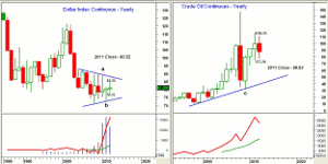
|pagebreak|The fate of the dollar has been part of the monetary debate for the past four years. The yearly chart of the Dollar Index shows that its range has been narrowing over the past eight years.
- This raises the potential for a breakout of the ranges in 2013, as historically the dollar does often trend.
- On the upside, initial resistance is at 84.24, which is the high so far in 2012. Further resistance follows at 87.35.
- A move above 89.71 (the 2009 high) would cause a six-year upside breakout.
- As for support, watch the 78.12 level first and then the chart support (line b) at 73.50.
- A break below the 2011 low at 72.86 would be more negative. The low in 2008 was 71.05.
- Since the Dollar Index has closed marginally higher for the past three years, the OBV is well above its WMA.
- The monthly OBV (not shown) is below its WMA, and the chart still shows a pattern of lower highs and lower lows.
The yearly chart of the continuous crude-oil contract is dominated by the wide range in 2008, as the high was $147.27 and the low was $35.13. For the past three years, crude oil has managed to close higher,, but a lower yearly close is likely in 2012.
- In 2011, crude oil closed at $98.83, which is $12 below current levels.
- On the upside, there is resistance from the past two years at $110.55 and $114.83.
- As for support, a drop below the 2012 lows at $77.28 would be a sign of weakness, with the 2011 support at $74.95.
- From the chart, one can see that if the lows of the past three years are violated, there is quite a gap down to the long-term uptrend (line c) at $40.22.
- The yearly OBV is still in a clear uptrend, while the monthly OBV (not shown) has been below its WMA since February 2012.
What it Means: The violation of a yearly support or resistance level does not often receive wide attention when it occurs, but it can be quite significant, as it often signals a shift in balance between selling and buying pressure.
The January 2008 violation of the prior year's low in the S&P 500 was followed by a three-month bear market rally, but in the next year it lost over 50%.
How to Profit: For the key markets that you follow, I would suggest you make a list of the year's ranges at the end of each year so you can refer to them as the next year progresses.


