Though still widely recommended by many analysts, high-yield mortgage REITs have poor total returns this year. MoneyShow’s Tom Aspray shows you why you must look at the charts before you buy.
With another weak close on Tuesday the Spyder Trust (SPY) is now down 6.9% from its intra-day high on September 14. This does not look to bad when compared to the PowerShares QQQ Trust (QQQ), which has lost 10.7% but many of those searching for the highest yields have been hit even harder.
One of the long-term favorites of those desperate for high yields as well as TV’s best known and loudest stock picker has been Annaly Capital Management (NLY). Even though it has dropped 18.5% from its September 14 high, many are still recommending it for its current yield of 13.4%.
I began cautioning investors over a year ago to closely examine the chart and relative performance analysis of all high-yield picks. I felt then that the potential capital loss could offset their yields as their charts looked negative.
According to Morningstar.com the total return of NLY for the YTD is 0.63% versus 14.8% for a diversified REIT and 11.4% for the S&P 500. Looking out longer term the three-year total return for NLY is just 7.38%.
In mid-October the longer term outlook had weakened further suggesting that after an oversold bounce they were likely to go even lower. From its late October high to Tuesday’s low NLY has lost another13.5%. If you are long one of the mortgage REITS or are considering buying one, a look at their charts may change your mind.
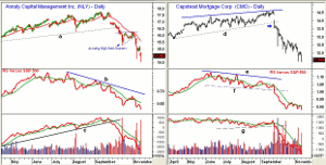
Chart Analysis: The daily chart of Annaly Capital Management (NLY) shows an upward trading channel, lines a and b, that was violated on October 8. Over the next four days it dropped another 8%.
- The chart shows that the rebound from the lows traced out a flag formation as NLY rallied from a low of $15.27 to a high of $16.20, stalling at the declining 20-day EMA.
- This set the stage for the recent plunge to the $14 level. This level corresponds to the spike lows in 2010 and 2011.
- The relative performance, or RS analysis has been diverging from prices, line b, since the July highs and made further new lows Tuesday.
- The weekly RS analysis (not shown) has been negative since August.
- The daily OBV broke through its uptrend, line c, on September 27 and the selling was heavy over the past week.
- There is initial resistance now at $14.80-$15.20 and then at $15.60
As I have noted before Capstead Mortgage Corporation (CMO) is a $1.2 billion, Dallas-based REIT that currently yields 12.1%. It peaked at $14.59 on September 24 and has had a low this week of $11.42. This is a drop of 21.7%.
- The next band of support is in the $10.60-$11.20 area.
- While CMO has been forming higher highs and higher lows, the RS line has formed lower highs, line e.
- The relative performance dropped through support, line f, on September 26 confirming the break of price support (see arrow).
- The daily OBV formed lower highs during the summer and broke through support (line g) in late September, confirming the price action.
- The weekly OBV (not shown) has also broken its major uptrend.
- There is resistance for CMO now in the $12.20 to $12.60 area.
NEXT PAGE: Two Other Land Mines
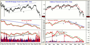
|pagebreak|Anworth Mortgage Asset Corp. (ANH) is a $846 million REIT that current yields 10.4% but has a total return for the YTD of -1.6%. The daily chart shows the down gap through support, line b, and it subsequently has dropped from $6.50 to $5.50.
- The next major support is in the $5.10 area which goes back to 2008.
- The relative performance shows a long term divergence, line c, which signaled that it was acting weaker than the S&P 500.
- The daily on-balance volume (OBV) dropped below the support, line d, that went back to November 2011.
- The volume has been very heavy since the end of September and the OBV is well below its WMA.
- The weekly RS and OBV analysis (not shown) are both also negative.
- The daily chart has a band of resistance in the $6-$6.30 area.
Hatteras Financial Corp. (HTS) is a $2.5 billion REIT that is based in North Carolina and currently yields 12.3%. HTS had a high on September 21 of $29.67 but just a week later dropped through the support from the June lows, line e, at $27.80. It has a YTD total return of 5.54%
- The recent lows are not that far below the mid-October lows so a short term bottom could be forming.
- There is minor resistance now at $26.25 with stronger at $27-$27.30.
- There relative performance broke below support, line f, in early August warning of the future price decline.
- The RS line is now in a downtrend, line g, and shows no signs yet of bottoming.
- The heavy volume on June 21 pushed the OBV below its uptrend (line h), which confirmed the negative divergence, line i.
- The OBV has continued to form lower lows over the past three months indicating that long positions were being liquidated.
- The OBV made further new lows this week.
What it Means: I hope that many of those investors looking for outsized yields will also understand that these yields have a high level of risk. In my opinion, they are not now suitable for investors but can sometimes offer some good trading opportunities.
These examples also hopefully reinforce the importance of doing your own research and to not blindly follow anyone’s recommendations, especially those who continue to recommend a stock that has steadily declined for a few years.
For those who are still long any of these four REITs, another bounce is likely over the next few weeks. As was the case in the middle of October, it should be an opportunity to sell any long positions or to place a hard stop under the lows.
How to Profit: No new recommendation.


