Some of the best investing or trading opportunities occur when you can determine that a stock or ETF is being accumulated, so MoneyShow’s Tom Aspray illustrates how the Demand Index can be a useful indicator.
Volume has always played an important role in my analysis as I have discussed in my articles on the On Balance Volume (OBV). Often times looking at a histogram plot of the daily or weekly volume, you cannot get a clear idea whether the buyers are stronger or weaker than the sellers.
Some of the best investing or trading opportunities occur when you can determine that a stock or ETF is being accumulated. These are the ones that you want in your portfolio as, often before a sharp rally, the buyers are already in control of the market.
One of my other favorite indicators that uses volume in addition to price is the Demand Index (DI), developed by James Sibbet. He used it almost exclusively in the commodity markets, especially the precious metals, but I have found it to be a useful tool for stocks, ETFs, or futures.
Several years ago, I wrote about the Demand Index in John Murphy’s classic book Technical Analysis of the Financial Markets. I also had the pleasure of meeting Mr. Sibbet several times early in my career and I was impressed by the passion he had for his analysis.
This indicator looks at the change in price along with the volume to calculate the buying pressure (BP) and the selling pressure (SP). The actual formula is quite complex but the indicator is available in many charting programs. Sibbet's original scaling method was modified so that it could be displayed on a normal scale.
The most simplistic interpretation is that when the DI is rising, the BP is greater than the SP. Conversely, when it is falling, the SP is greater than the BP. When the Demand Index is above the zero line, the total buying pressure is greater than selling pressure.
As was the case with the OBV, signals from the weekly data should be used to determine the major trend. For example, if the weekly studies are positive and the daily studies are negative, a short position would be recommended only for scalpers with tight stops. This is because the conflict between the daily and weekly analysis suggests just a pullback in the positive major trend.
Conversely, if the daily studies were also positive, a larger position with wider stops could be taken. Divergence and trendline analysis are the keys to gaining important signals from the DI.
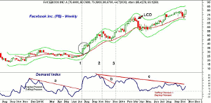
The weekly chart of Facebook, Inc. (FB) starts in late 2012, as the DI peaked at the end of November 2012, as the weekly starc+ band was being tested. After a four week pullback to the 20-week EMA FB resumed its rally and easily exceeded the previous high.
As FB was making its new high, the DI was diverging from prices, line a, which meant that there was less buying pressure on the new price highs. By the end of February, the DI dropped below the zero line indicating the selling pressure was now greater than the buying pressure.
This was the start of a six month correction and while the DI did make it back above the zero line in early May, it failed to move above the bearish divergence resistance at line a. The DI made a new correction low in early June, and by the second week of July, had moved well above the zero line and its downtrend (line 1).
The DI rose very sharply as FB closed above its weekly starc+ band for three consecutive weeks (see circle). The DI made another new high in the latter part of September but then formed a short-term negative divergence on the new high four weeks later, line b.
It is vital to remember that the length of the divergence is important as this divergence formed over a shorter-time period that the previous one. The ensuing correction only lasted six weeks as the 20-week EMA was again tested.
The downtrend in the DI, line b, was broken by the middle of December just two weeks after the correction low (line 3). FB pushed higher in early 2014 and the week ending February 28 it formed a doji.
Three weeks later, an LCD sell signal was triggered as FB closed the week below the doji low. The DI had failed to make a new high with prices, line c, and was already declining as the LCD was triggered.
The DI has stayed above the zero line ever since indicating that there was more buying than selling pressure but the downtrend in the DI has not yet been broken as prices have moved higher.
NEXT PAGE: How the Two Time Periods Can Be Used Together
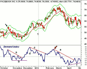
|pagebreak|The daily chart of Facebook, Inc. (FB) illustrates how the two time periods can be used together. The daily chart begins as the October 2013 high was being formed and the weekly DI was forming a negative divergence. FB had gapped higher and formed a doji above its daily starc+ band, signaling that it was in a high risk buy area (see arrow). A daily LCD was triggered two days later.
The correction on the daily chart was quite normal as one was able to draw a clear downtrend in the DI, line a. Even though prices made lower lows at the end of November, the DI did not make a new low, line b.
The daily downtrend in the DI was broken three days after the lows and this was followed by a move in the DI back above the zero line, indicating an increase in buying pressure. The DI peaked in December as the starc+ band was tested. After a brief period of consolidation, FB made another new high but the DI was declining.
There was another new high in early January that was not confirmed by the DI, line c. The break of the support in the DI, line d, confirmed the divergence and warned of a correction (line 1). FB actually made another new high five days later before a 12.5% drop from high to low. The weekly DI had already moved through its resistance so this was thought to be a correction not a major top.
The DI dropped into oversold territory as it headed into earnings on January 30 when it gapped $9 higher and closed above the daily starc+ band. As is often the case with the starc bands, FB moved sideways for six days as the downtrend in the DI, line c was overcome.
As FB was rallying sharply at the end of February, the DI failed to move above the December high (see arrow) and the weekly DI was also diverging. Another negative divergence (line e) was formed as FB hit a high on March 11. This downtrend was not broken until April 21 and the DI formed a bullish divergence on the next decline, line f.
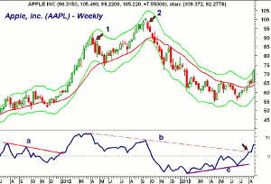
Apple, Inc. (AAPL) was a favorite of option traders before the stock split as few could afford to buy large blocks of the stock. It is also a good example of how peaks in the DI often correspond to tests of the starc+ bands. In July of 2011, AAPL rallied for five straight weeks to close above the weekly starc band. The following week, the DI turned down as AAPL declined 10% to its 20-week EMA.
AAPL made further new highs in September and early October while the DI formed a negative divergence, line a. It was almost three months later before the DI moved above the zero line and this resistance signaled a new rally phase. From just under $60, AAPL rallied to above $90 by the middle of April and the starc+ band was tested for several consecutive weeks.
The weekly DI did not form any divergences at this high, but the following week, a LCD doji sell signal was generated. Without any negative divergences, this was expected to be just a correction in the uptrend and the 20-week EMA did provide support four weeks later.
The DI held well above the zero line on this correction as the buying pressure was greater than the selling pressure. By early August, the DI again started to move higher as AAPL accelerated to the upside reaching a split adjusted $100.74 the week ending September 21. A doji was formed that week and a low close doji sell signal was triggered the following week (point 2).
The Demand Index had formed a twenty-four week divergence, line b, at this high, and by mid-October, it had dropped below the zero line. AAPL dropped to a low of $66.14 in early January 2013 as the starc- band was reached. By the middle of April, AAPL made a further new low at $55.01, line c.
The DI was forming higher lows, line c, which was consistent with the formation of a bottom. This bullish divergence support was tested again at the end of June. By the end of July, the DI had moved above the zero line and in August the bearish divergence resistance at line b, was broken.
NEXT PAGE: What About Low Risk Entry Points?
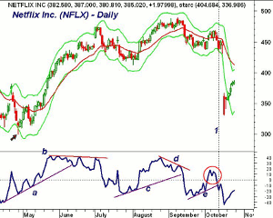
|pagebreak|For option traders, the daily DI analysis and the starc band analysis can help one identify low risk entry points. On April 28, Netflix, Inc. (NFLX) spiked to a low of $299.50, which was well below the daily starc- band. The DI bottomed in March and then formed a higher low at the end of April, line a. This support held at the next low and, on May 12, the DI moved well above the zero line.
The DI support, at line a, was not broken until mid-June as NFLX had moved to $422.45. This was an early warning sign as the stock continued higher. It finally peaked at $475.87 as the daily starc+ band was exceeded. The DI had formed several negative divergences as NFLX was moving higher, line b.
NFLX eventually dropped to a low of $412.51 when the DI formed a short-term positive divergence, line c. The DI made a marginal new daily high on August 25, and ten days later, when NFLX made a new high, the DI did not, line d. The support in the DI was broken four days after the high and it dropped below the zero line the next day as the sellers had again taken over.
The DI formed another short-term bottom formation in early October, line e, as the DI moved back above the zero line as NFLX again came close to its daily starc+ band. The DI formed slightly lower highs (see circle) before dropping back below the zero line. The uptrend in the DI (line e) was broken on October 10 with the close at $452.08.
Three days later, NFLX opened at $332.73 in reaction to the announcement that it has added fewer subscribers than expected. The cross below the zero line gave one plenty of time to establish bearish option strategies before prices plunged.
If you decide to use the Demand Index in your analysis, it is important to realize that it, like the OBV, will not always form positive or negative divergences at every turning point.
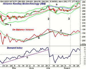
On the daily chart of the iShares Nasdaq Biotechnology (IBB) I have added the OBV along with its WMA. The OBV did not form a positive divergence at the April 15, 2014 lows (point 1) but the DI did and moved above the zero line on May 22.
Both indicators were in solid uptrends until July 7 when the DI dropped below its support at line c and the following day it dropped below the zero line (line 2). The OBV violated its support a few days later but neither formed a negative or bearish divergence at the highs.
During the ensuing correction, line a, IBB retraced 38.2% of the rally from the April lows. Toward the end of July, the OBV had formed a clear downtrend, line d. On August 13, one day before prices broke through their resistance, the OBV overcame its downtrend, line d. The same day (line 3), the DI moved back above the zero line indicating that the buying pressure was now greater than the selling pressure.
On liquid stocks, futures, or ETFs, one can also use the Demand Index on hourly data. At the October 15 lows, the hourly DI on the Spyder Trust (SPY) had formed multiple positive divergences. It crossed above the zero line on the opening October 17. It did not drop back below the zero line until after the FOMC announcement on October 29.
Once you look at the Demand Index in this manner I feel confident that you will start to see the same familiar patterns that I have discussed in this article. After careful examination, you will first identify the uptrend or downtrends in prices and in the Demand Index that are developed from points that are 10-15 days apart.
Often times, these support or resistance lines will generate signals that will last for 30-50 days, which could benefit the portfolios of both traders and investors.

