

Greg Harmon of Dragonfly Capital looks to the charts and shares his thoughts on the weakness in gold compared to the S&P.
Gold (GLD) has been weak relative to the S&P 500 (SPY). This has been the case since mid-2011. And throughout 2014 there have been signs that there might be an inflection point in the making. Gold might be ready to strengthen against equities. But the past few weeks have shown that it is not time for the fat lady to sing yet.
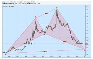
Click to
Enlarge
The chart above shows nearly 10 years of relative performance of Gold to the S&P 500. It traces out a bullish Shark harmonic, which sounds great for a reversal. Except that the bullish part of that harmonic pattern kicks in after it has fallen to point D, another 25% lower in the ratio. Or worse, at a ratio of 0.21 another 45% lower. Ugh. She had better take a seat or order some food. What looked like short-term support at the prior 2008 levels is now turning into a breakdown from consolidation. There is not enough room in the chart for where the Measured Move would target. And there is no certainty that it will reach any of these targets. But what this mosaic of technical analysis pointing lower tells you is that there are a number of different types of traders all looking to trade this lower still. What are you gonna do about it?
By Greg Harmon of Dragonfly Capital


